After 30 days of change, Yahoo has finally revealed its new mark to the public. For a brand that's been valued at over 10 billion dollars, you'd think Mayer & Co. would spend more then just a weekend in a garage to come up with a re-brand. But as a matter of fact, that's exactly what she did and as a result, the new logo is not good.
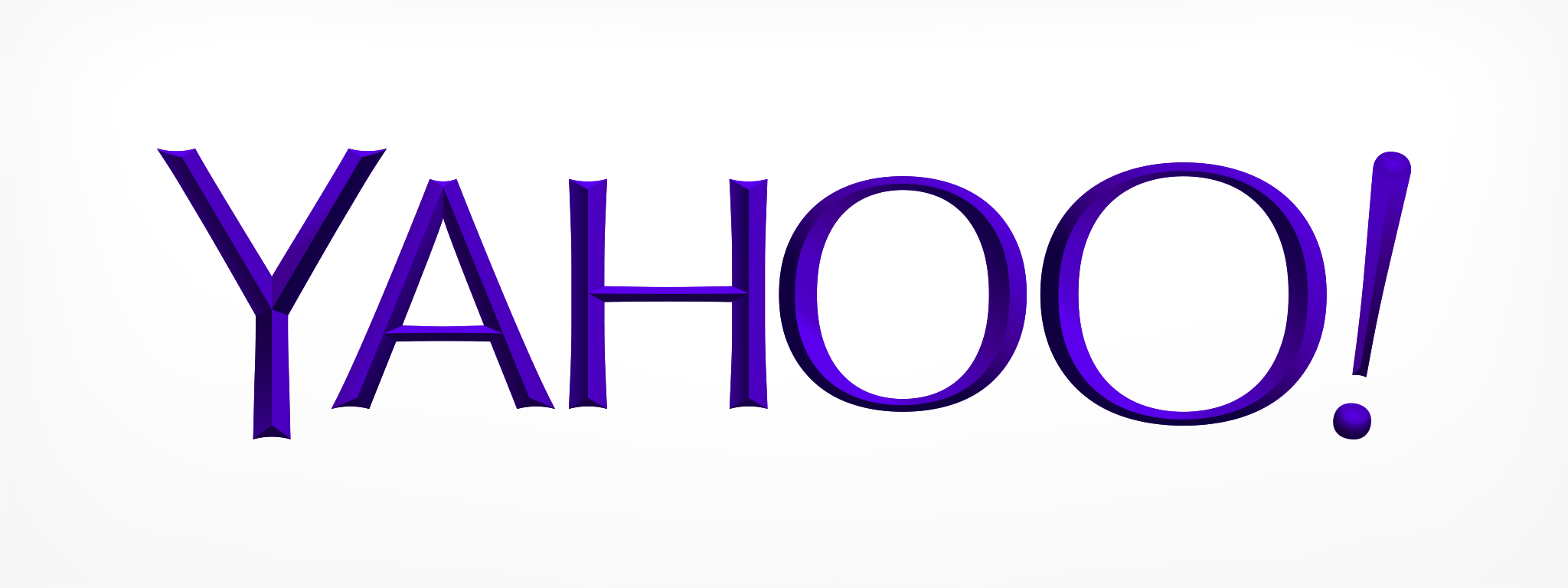
The new Yahoo! Logo.
Let's talk about a few things:
First and foremost, the choice of Optima is strange since Mayer was insistent that the logo remained "whimsy". Optima, as a typeface, with its clear and precise lines are used most commonly for refined, high-end product branding. Astin Martin, Estee Lauder, Marks & Spencer all use Optima to communicate its brands class and elegance.
The refined characteristics of Optima demands precise typesetting. Dead-straight baseline and exact kerning are all essential elements to maintaining Optima's voice. While Optima is a beautiful typeface, the font stands for the exact opposite of Yanoo's playful character and should have never made it onto the typography short-list to begin with.
But it gets worse.
The amount of stretching, resizing and general let's-mess-with-the-type-just-for-the-hell-of-it approach is simply cringe inducing. I hate to sound dramatic, but the typography treatment here is about the same as buying Versace and then cutting one sleeve shorter "just for fun".
On top of all this, the logo have lost the flow of the original. With the previous serifs logo, the viewer's eyes were guided across the logo. But since Optima has such contrasting stroke widths, and such an emphasis on vertical lines, the mark becomes hard to read and the natural flow is disrupted.
And oh yes, the "chisel" (read: bezel) effect certainly doesn't help either.
Fundamentally, a logo should speak about your brand and what it stands for. This logo doesn't do it nearly as well as the old one did.