Yep... That sounds about right. Credit.
2014 Predictions for Web Design
A great piece put together by Collis Ta'eed about where he sees web design moving in 2014. I agree with a lot of his points. Here are the highlights:
Moving Past Flat
Flat has a long way to go yet, and so the main changes I think we’ll see in the next year are more fun, but faddish, trends like long shadows and the like. In similar fashion I think we'll see some more depth, layering, graduations, and other visual distinctions making their way back in, but in a more refined and subtle way than the old days.
More Motion
For web and interface designers, motion will be used to differentiate the otherwise very simple flat design ethos, as well as create more engagement.
An example that springs immediately to mind was Polygon's excellent incorporation of motion in their review of the PS4 and their review of the Xbox One. I'd be lying if I didn't admit to spending a good 40 minutes first amazed, then trying to figure out how the damn thing worked.
Better Tools
Adobe’s lack of tooling over the years left a nice open gap which has seen products like Sketch, Typecast, Codiqa and the upcoming Macaw, try to step in. I love seeing great indie products, and am extremely excited to see how Macaw goes.
Some other excellent tools I've incorporate into my workflow include Briefs for mobile wire framing and interaction planning, and WebCode which lets you draw vector and export as HTML + CSS, SVG or JavaScript.
It's going to be an exciting year.
Are you Geared Up?
If there is a way to do Christmas advertising so right, then there is a way to do Christmas advertising so wrong.
May I present Samsung's new Galaxy Gear commercial:

So let me get this straight: If I have a Samsung Galaxy Gear, I can impress random girls on a snow lift with my incredibly useless gadget, then give my self permission to follow her around taking pictures, then become swave and charismatic at a night club and end the night with the girl I stalked all the day in my arms.
Really?
Did anyone who worked on this advert actually think this through? Or ever been on a ski holiday? Or taken a picture with that watch? Or dictated to it? Because none of what's being shown is grounded in reality. There is not a single ounce of product truth and frankly, borders on false advertising. For God sakes, who green lit this thing?
Not only is the concept bad, the execution is terrible too. The acting is atrocious, all the environment looks like it was shot in front of a 30 dollar green screen, and what's with the comic style finish at the end?
tl;dr: Incredibly bizarre, insanely creepy and really hard to watch.
It's a Christmas Miracle
Seriously. The power of this new Mac Pro is simply staggering. Watch the video below and tell me your current production rig can do that: (spoiler: With 18 effects applied to a RED 4K footage, the Mac Pro was able to playback the video in real-time without dropping a single frame)

All this performance do come with a price. The machine in the video, speced out on the Apple Canada web store comes to $8,199.
The one sheet of the specs are:
- 3.0GHz 8-core Intel Xeon Processor with 25MB of L3 cache
- 64GB (4 x 16GB) of 1866MHz DDR3 ECC RAM
- 1TB PCIe-based flash storage
- Dual AMD FirePro D700 GPUs with 6GB of GDDR5 VRAM each.
Yes, it might truly take a Christmas Miracle for me to ever own one of these machines, but a boy can certainly dream.
Happy Christmas Everybody
Misunderstood
I usually try not to gush all over Apple commercials. But gosh, this is simply their best campaigns this year. (And certainly the strongest campaign in the last 4 holiday quarters)

This spot perfectly encapulate Apple's campaign from earlier in year when they focused on bringing customer delight with its products. The spot integrate products and strategy so seamlessly - it's practically art. It's just perfect.
Tab Closed; Didn't Read
I believe that being a web designer means becoming an ambassador for good interface design. Which means beyond generating leads, and creating business results, designers should always strive to create customer delight.
This being said, organizations big and small often times forget this basic principle and make content and design decisions that are hostile to their users.
So, let's draw that line in the sand right now. If you're going to insist on obscuring your content with some stupid social s***, a promo for your app or a full-page newsletter signup form, then I'm not going to read your content. Or click on your ads. Or help you generate revenue in any way. Ever.
TC; DR
On Yahoo's New Logo
After 30 days of change, Yahoo has finally revealed its new mark to the public. For a brand that's been valued at over 10 billion dollars, you'd think Mayer & Co. would spend more then just a weekend in a garage to come up with a re-brand. But as a matter of fact, that's exactly what she did and as a result, the new logo is not good.
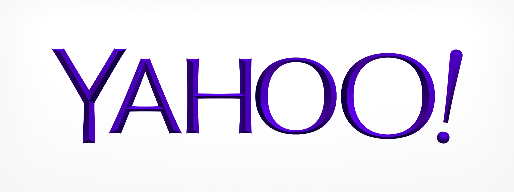
The new Yahoo! Logo.
Let's talk about a few things:
First and foremost, the choice of Optima is strange since Mayer was insistent that the logo remained "whimsy". Optima, as a typeface, with its clear and precise lines are used most commonly for refined, high-end product branding. Astin Martin, Estee Lauder, Marks & Spencer all use Optima to communicate its brands class and elegance.
The refined characteristics of Optima demands precise typesetting. Dead-straight baseline and exact kerning are all essential elements to maintaining Optima's voice. While Optima is a beautiful typeface, the font stands for the exact opposite of Yanoo's playful character and should have never made it onto the typography short-list to begin with.
But it gets worse.
The amount of stretching, resizing and general let's-mess-with-the-type-just-for-the-hell-of-it approach is simply cringe inducing. I hate to sound dramatic, but the typography treatment here is about the same as buying Versace and then cutting one sleeve shorter "just for fun".
On top of all this, the logo have lost the flow of the original. With the previous serifs logo, the viewer's eyes were guided across the logo. But since Optima has such contrasting stroke widths, and such an emphasis on vertical lines, the mark becomes hard to read and the natural flow is disrupted.
And oh yes, the "chisel" (read: bezel) effect certainly doesn't help either.
Fundamentally, a logo should speak about your brand and what it stands for. This logo doesn't do it nearly as well as the old one did.
Our Signature - Thoughts on Apple's Campaign
There has been a lot of talk on Apple's new campaign. Some good, some maybe and some down right ugly.

My thoughts:
I think perhaps people are looking at this ad the wrong way round. I really believe that this is an ad created and aimed for folks at Apple instead of the general public.
Think about it.
The "Rebel" ad came out when Apple was down and out. Jobs had just returned to a completely hollowed out and demoralized company. He needed to remind Apple who they were. He needed to tell people at Apple that they were still special, still different. It was a rally call for the troops.
I think this ad is very much in the same vein; except the rally call is different. The call this time highlights Apple's fundamental philosophy about how they approach not just products, but everything they do, everything they touch. It very much defines and focuses the company by saying: It doesn't matter what we work on, but you can be damn sure whatever it is, we don't put our name on it till we can move people, until we can make people's lives better, until we can change the world. This is the new rally point. It was written to remind the troops at Apple why they show up to work and why they build their products the way they do.
If you think about the ad like that. It is extremely powerful. They are making a promise, setting a water mark publicly. It was written and executed perfectly.
This is institutional advertising at its best.
Asking the right questions.
Einstein famously said:
“If I had an hour to solve a problem and my life depended on the solution, I would spend the first fifty-five minutes determining the proper question to ask, for once I know the proper question, I could solve the problem in less than five minutes.”
Now of course, unless you are Einstein, the answer might take you longer than five minuets to answer, but the lesson here is very relevant to designers:
Remember: You can't solve your client's problems if you don't ask them the right questions.